Welcome, watercolorists! Over the next ten weeks, you will be challenged to strengthen your watercolor practice through weekly in-person classes and at-home exercises. These practices are designed to guide your individual development and help you grow beyond the classroom setting.
To get started, commit to painting at least one day each week outside of class. Paint something that brings you joy, sparks your curiosity, or encourages you to experiment. Use this blog as a launching point for ideas, inspiration, and additional instruction throughout the course.
Understanding Value
On our first day of class, we began talking about value. Value—the range from light to dark—is essential to successful watercolor painting. Every color has its own value scale. Learning to control the amount of water and pigment in your brush will help you create depth, contrast, texture, and form.
In class, we explored an arrangement of objects on a flat surface, paying close attention to their shapes, textures, shadows, and surrounding spaces. This exercise is called negative painting with a monochromatic still life.
Introduction to Watercolor Syllabus
At-Home Practice
(Let go of the need to label your art as “good” or “bad.” That’s the job of critics and audiences, not creators. Your job is to explore, express, and learn. You are too close to your own work to judge it objectively. Instead of asking, “Is this good?” ask, “Does this feel true to me? What did I learn? What do I want to try next?” Your value as an artist isn’t in a verdict, but in the courage to keep creating.)
Choose an image to paint or arrange your own at home . Choose a collection of objects ( leaves spoons, stones, even tubes of paint ) . You can trace these objects and paint them.
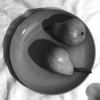
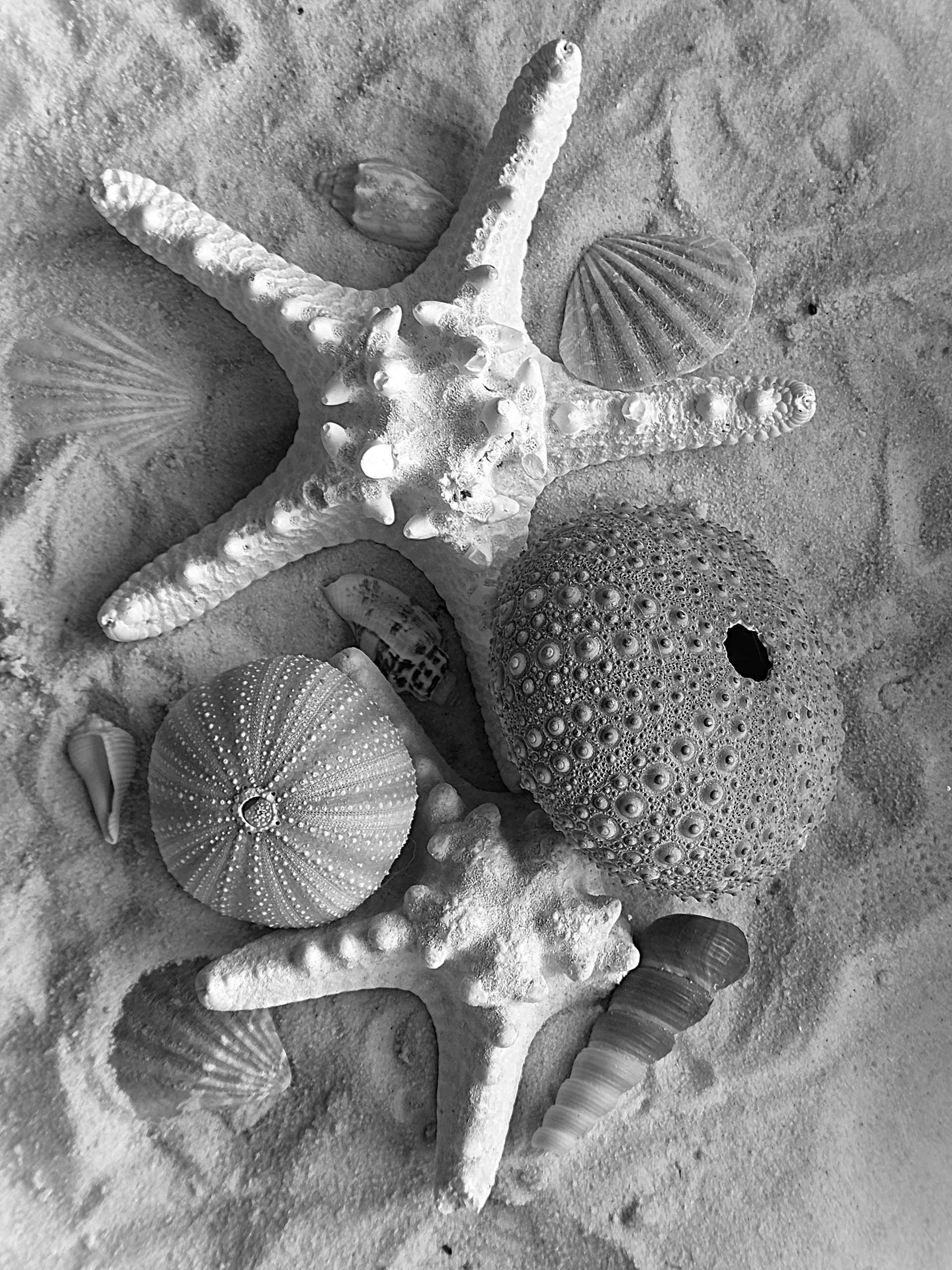
- Choose one color for your painting. Might I suggest blue? It is such a beautiful and versatile color.
- Create five different values by diluting the paint using the tea, coffee, milk, cream, and butter method. Tea represents the lightest, most watery mixture, while butter represents the darkest and most concentrated mixture.
- Lightly sketch or trace a simple arrangement of objects. ( leaves spoons, stones, even tubes of paint )
- Begin painting the spaces around and between the objects. Observe the shadows carefully and build your values gradually from light to dark.
- Allow each layer to dry before adding another wash. This will help you maintain clean shapes and control your values.
Want more practice? Try to add color after you have completed the monochromatic color study ( CLICK HERE )

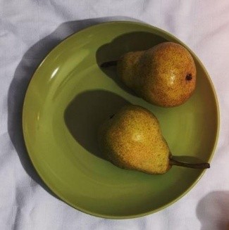
Complete your monochromatic still life on cotton watercolor paper and bring it to our next class. We will share our work and discuss what we discovered during a supportive group critique.
Most importantly, enjoy the process. Watercolor rewards patience, observation, and a willingness to let the unexpected become part of the painting.
Shopping for Local for Art Supplies?
Local/Online Art Stores to Explore:
We are so lucky to have these incredible resources right in our backyard.
- Blue Goose Art Supply (Rock Hill, SC): A beloved staple for York County artists. Their friendly staff is incredibly knowledgeable, and they carry a wonderful selection of professional-grade watercolor paints and papers.
- Jerry’s Artarama (Charlotte): Wow! You can find everything you need here, often at high prices. It’s a fantastic place to compare brands side-by-side.
- Micheals (Local Art Store): While they carry a wide variety of crafts, their art supply section is robust. They are a great spot to pick up core watercolor supplies like pads of paper, sets of tubes, and a variety of brushes.
- Hobby Lobby Local Art Store: Don’t forget to check out local art chain stores. They often carry limited watercolor supplies.
- Cheap Joes (Boone, NC): A beloved staple for Triad-area artists.
- Online : Amazon
- Online: Dick Blick
In class we created a value scale using blends of Greens, then paint a houseplant where every leaf has a different value—from pale tea to thick butter. Let’s go!
Step 1: The Value Scale ( click here )
Think of your watercolor pigment as an ingredient you dilute or concentrate.
| Value Level | Name | Consistency | How to Mix |
|---|---|---|---|
| 10% | Tea | Transparent | 1 drop pigment : 9 drops water. Flows like weak black tea. |
| 20% | Coffee | Semi-transparent | Slightly more pigment. Looks like coffee with cream. |
| 40% | Milk | Medium transparency | Like 2% milk – you see through it, but it has body. |
| 60% | Cream | Semi-opaque | Heavy cream texture. Starts hiding pencil lines. |
| 75% | Butter | Opaque | Thick as melted butter. Use straight from the pan with minimal water. |
Pro Tip: Always mix more of each value than you think you’ll need. Consistency is harder to match later.
INTERMEDIATE WATERCOLOR AT HOME PRACTICE