Watercolor artists can build color in two primary ways: layering transparent washes or mixing and applying the intended color directly. Learning both approaches will give you greater control over hue, value, intensity, and atmosphere.
Direct Painting
Direct painting asks, “What is the best color before my brush touches the paper?”
Direct painting requires you to mix the correct color and value before placing it on the paper. The goal is to get the mixture as close as possible to the intended result the first time.
Colors may be mixed in the palette before application or allowed to blend wet-in-wet directly on the paper. After the wash is placed, it is generally left alone instead of being repeatedly adjusted or glazed.
Direct painting often produces fresh, clean, and expressive color. It also encourages careful observation and decisive brushwork.
Before making a mark, ask yourself:
- Is the hue correct?
- Is the value light or dark enough?
- Is the color too bright or too dull?
- Is there enough water in the mixture?
- Can I place this wash confidently and leave it alone?
Hue, Value, and Intensity
As you mix your colors, compare each mixture to the original painting in three ways:
Hue refers to the color family, such as red, yellow, blue, green, orange, or violet.
Value describes how light or dark the color appears.
Intensity describes how bright, vivid, muted, or neutral the color appears.
A successful mixture must match more than the basic color name. For example, two mixtures may both appear blue, but one may be lighter, duller, warmer, or more intense than the color in the reference painting.
Layering in Watercolor
Ask yourself : Layering asks, “How can I gradually build this color?”
Layering—also called glazing—is the process of placing one transparent wash over another after the previous layer has completely dried. Each glaze gradually deepens the value and can create new, subtle hues.
When working with this method, begin with the lightest values and allow each wash to dry before adding the next. Continue building color until you reach the darkest and most saturated areas of the painting.
Because watercolor is transparent, the earlier layers remain visible beneath the later ones. This creates luminous, complex colors that may be difficult to achieve through a single mixture.
Remember:
- Begin with light, diluted washes.
- Allow each layer to dry completely.
- Gradually deepen the value.
- Save the darkest, most saturated colors for last.
- Avoid excessive layering, which can make colors appear dull or muddy.
In class Assignment
Reproduce the painting as closely as possible. Focus on mixing colors that match the original in hue, value, and intensity. Your goal is to get each mixture “right the first time.”
Look closely at the reference painting. The only noticeable glazing or layering appears in the ultramarine foreground water shapes and the boat masts. Most of the other colors were placed as flat washes or blended wet-in-wet and then left alone. This is an example of direct painting.
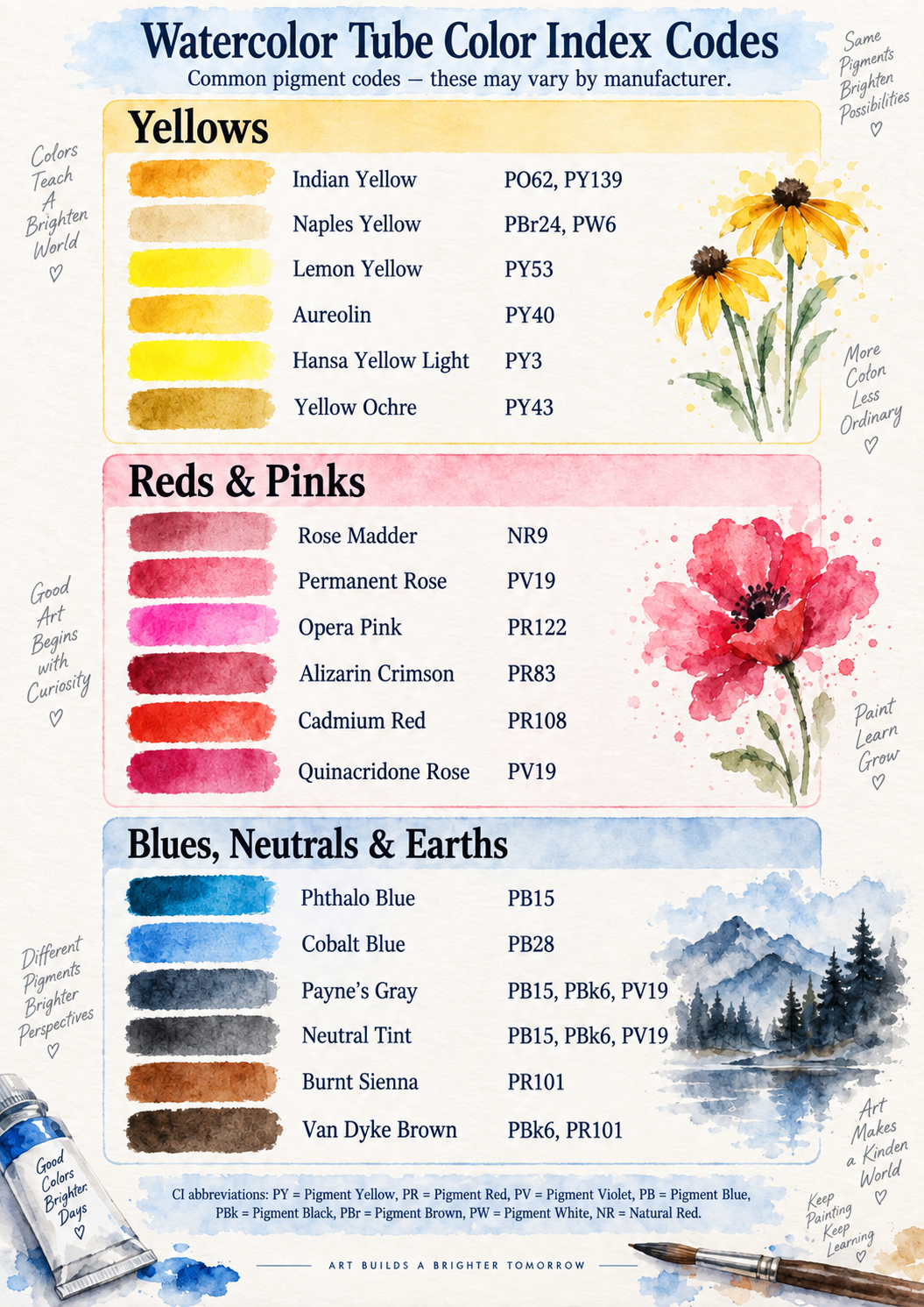
Use the assigned pigments for this exercise. You may mix them in your palette before painting or allow them to mingle wet-in-wet directly on the paper.
- Begin with the lighter pigment, and add very small amount of the darker pigment. Test each color with a small paint a swatch.
- Continue until you have created a full range of mixtures.
- Label the pigments and, if helpful, record their approximate proportions.
Final Reminder
Neither method is better than the other. Each produces a different visual effect. Glazing creates depth, luminosity, and subtle color shifts, while direct painting creates freshness, clarity, and confident brushwork. The more you practice both approaches, the more intentionally you can choose the method that best serves your painting.


Who do I look to for inspiration ? If you enjoy free classes], I’ve got exciting news there are plenty more where those came from!
Louis De Masi : Click Here
Youtube Tutorials : Click Here White Florals : Click Here


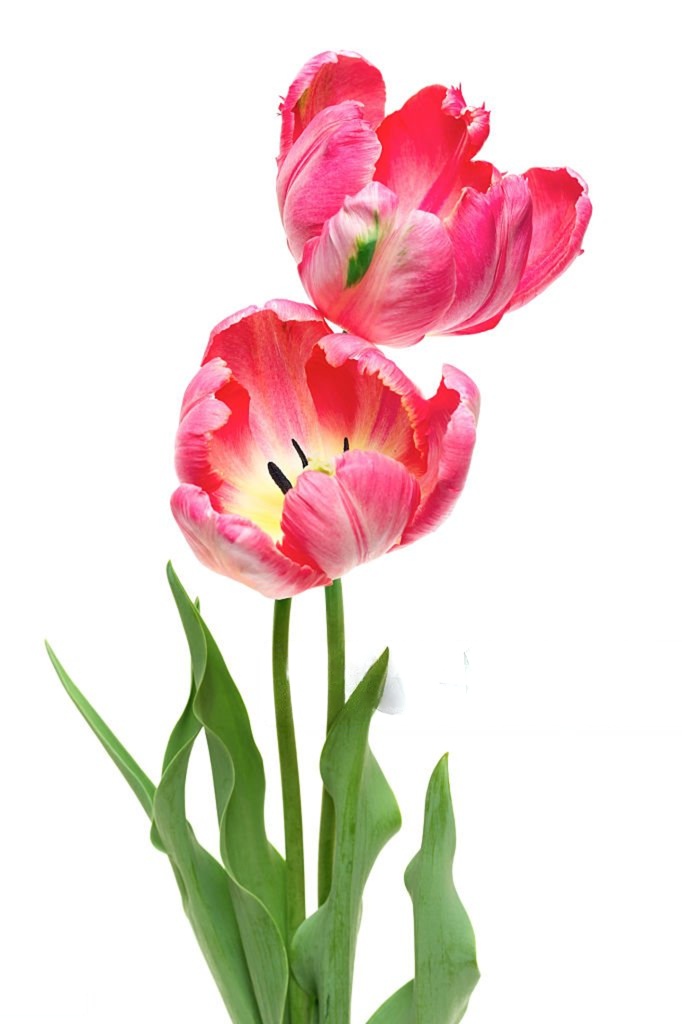
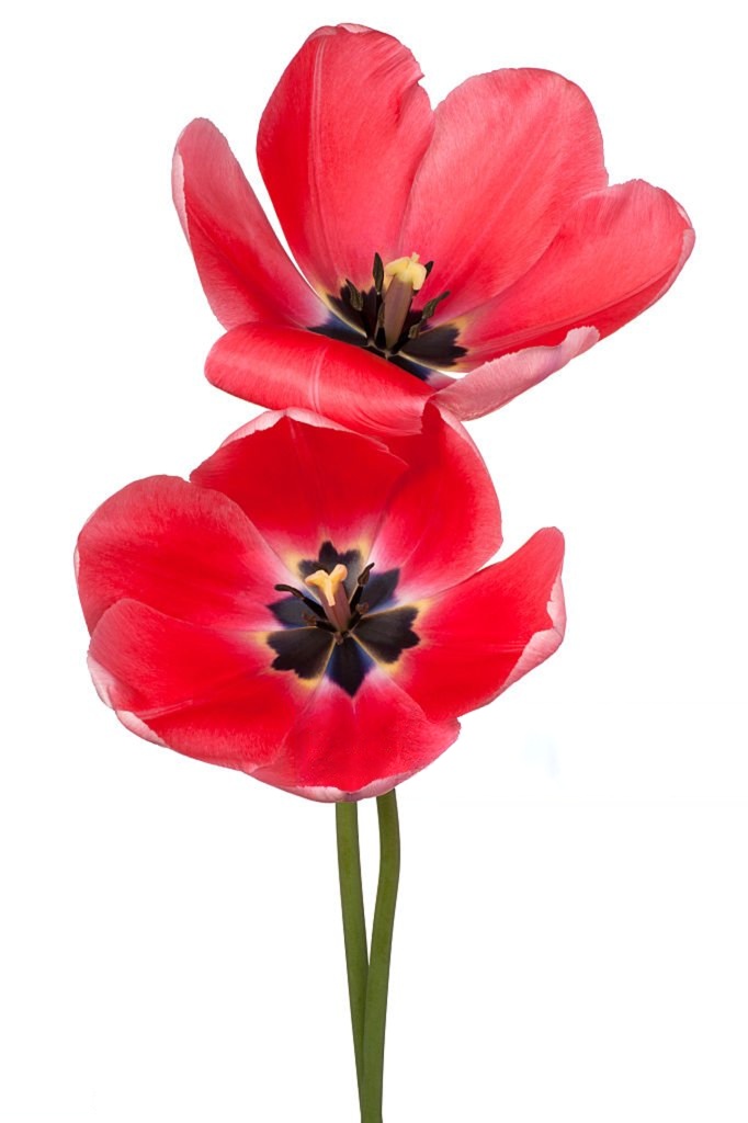
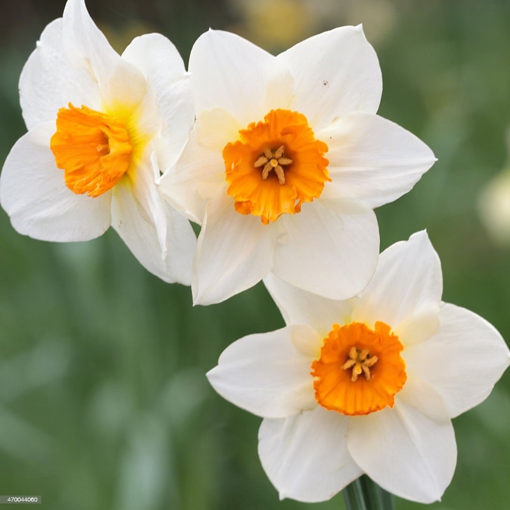
6 Tips for Expressive Floral Art
While you’re here, I want to share some powerful insights to master watercolor floral art. It is not just about technique but about seeing flowers in a new and magical way.
1. Flowers Are Never a Solid Colored
You don’t need a huge palette, but you do need to mix tones of a color. Adding a bit of blue to your pink will slowly create a cool purple hue. By layering and glazing colors you can create depth, light, and life.
2. The flower is More Elaborate Than You Think
Accept that you don’t fully understand a flower’s form. Take time to study it because it’s always more complex than it appears. When painting realistically, don’t simplify what you see. Observe the folds, curves, and delicate overlaps.
3. Flowers Are Full of Gently Flowing Streams
Flowers may look still, but in paint, they should feel alive and moving. Every petal, shadow, and highlight is part of a dynamic, circulating flow. Let your brushstrokes follow that energy.
4. Flowers Are Never Separate from Their Surroundings
For realism, soften the edges between flower and background. Remember your edges. Colors interact, reflect, and blur in reality. Let the background breathe into the petals, and the petals into the space around them.
5. Macro-Painting: Flowers Can Be BIG!
Want more detail and impact? Paint larger. A tiny sketch fights realism. Try to allow a single flower to fill half the page. Maybe, imagine painting even bigger details become abstract and monumental.
Enjoy the Journey and Build your studio practice
Homework:
- Paint a Floral
- Sign your painting with a small paint brush
- Put your painting in a small frame
- Bring to class to share with everyone
(Let go of the need to label your art as “good” or “bad.” That’s the job of critics and audiences, not creators. Your job is to explore, express, and learn. You are too close to your own work to judge it objectively. Instead of asking, “Is this good?” ask, “Does this feel true to me? What did I learn? What do I want to try next?” Your value as an artist isn’t in a verdict, but in the courage to keep creating.)