Evaluate your Sketching Style Likes and Dislikes
Start by evaluating what you like most about their inking and watercolour techniques and style, and use that information to emulate what you like, and discount what you’re not interested in learning. For example, here’s my recap of the artist’s I mentioned above:
| Artist | What I like Most | What I don’t like |
| Felix Scheinberger | Bright Colours | Ink Lines too Loose |
| Peter Scheeler | Nice Clean Simple Lines | Not Enough White |
| Nil Rocha | Simple Skies, Limited Colour Palette | Subject Matter too Fantasyesque |
| Matty Burnham | Simple Line Style | Perspective too precise |
| John Harrison | Line weight variety. Composition/layout of the scene. | Sketching style not loose enough |
| Albert Keifer | Expressive Lines and perspectives (but too loose for me) | Heavy shadows and desaturated colours |
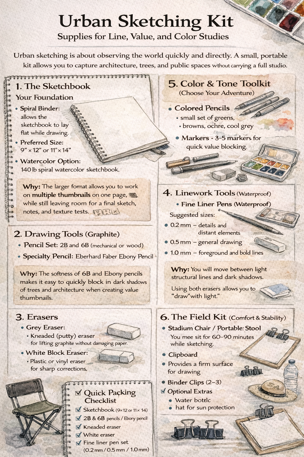
SUPPLY LIST
SKETCHING ON LOCATION


Today we sketched at Little Sugar Creek Greenway in Charlotte. NC


At Home:
Practice Drawing using Negative and Positive Space : Tutorial Click Here
Tips: Use Large Shapes, Find Patterns of Repeating Shapes, Use Varied Line Weights ( Thick bold lines define your focal point)
Urban Sketching Vocabulary Guide
- Contour Drawing: Drawing the edges of a subject with a continuous line, focusing on its form and outline.
- Composition: The arrangement of elements (buildings, trees, people) within your sketch to create a balanced and engaging scene.
- Focal Point: The specific area where you want the viewer to look first, created using contrast or detail.
- Negative Space: The empty space around and between subjects (e.g., the sky around a building).
- Positive Space: The area occupied by your main subject (e.g., the building itself).
- Repetition/Pattern: Visual rhythm created by repeating elements like windows or bricks; suggest it, don’t draw every one.
- Varied Lines: Using a mix of thick and thin lines to create depth and interest (thick for foreground, thin for background).
- White Space: Untouched paper left intentionally blank to represent light or give the eye a rest.
Try it At Home:
- Composition Exercise : Include Foreground, Middle ground, and Background : Click Here Choose 5 to 10 Compositions and add to your sketchbook. Define each composition in the margins of your drawing. (Drawings can be thumbnail size and do not have to fill the page)


- Draw an interior in your sketchbook using 1-Point Perspective : Click Here
Week 2 : At Home Practice Drawing in 2 point Perspective ( the corner of the building)


How to Draw using 2 Point Perspective : Click Here
Draw Along with Artist to Practice : Click Here ( Draw your Residence )