Take Charge is a watercolor workshop all about water control, color movement, and the exciting technique known as charging.
Charging is the process of introducing color into an already wet area and allowing the pigment and water to interact. In this workshop, students will explore how charging can create beautiful transitions, unexpected textures, rich shadows, and expressive color while painting a crab.
Students will practice five charging techniques: Click Here


- Wet-into-wet charging — allowing colors to naturally flow and mingle.
- Wet-into-wet with line — introducing linear marks into a wet passage.
- Wet-into-wet dragging — pulling and dragging pigment through wet areas to create movement and texture.
- Wet-into-wet blossoms — using water blooms intentionally to create organic textures and patterns.
- Controlled charging — experimenting with water-to-pigment ratios to create soft transitions and stronger areas of color.
We will also explore one important wet-on-dry technique: glazing. By layering transparent washes over dry watercolor, students can build shadows, strengthen texture, define the crab’s form, and create a greater sense of depth.
Throughout the class, students evaluate how much water is on the brush, how much water is on the paper, and how pigment behaves at different stages of wetness. Instead of trying to control every movement of watercolor, we’ll learn when to guide the paint—and when to allow watercolor to do what it does best.
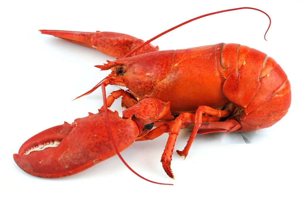
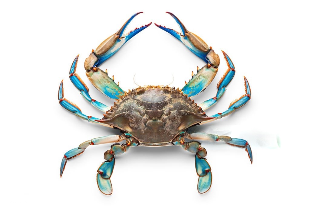
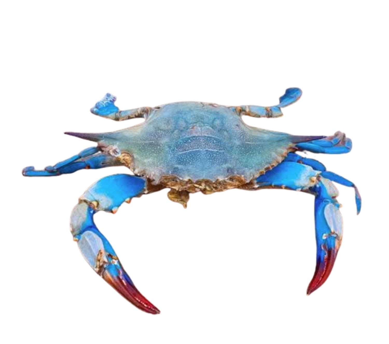
The crab becomes our playful subject for experimenting with shells, spots, edges, shadows, texture, and layers of beautiful transparent color.
Take charge of your water control today and paint a simple crustacean!
Stock Photo Link : Youtube Tutorial: Click Here

INTERMEDIATE WATERCOLOR COURSE
Painting Light: Creating Luminosity in Watercolor
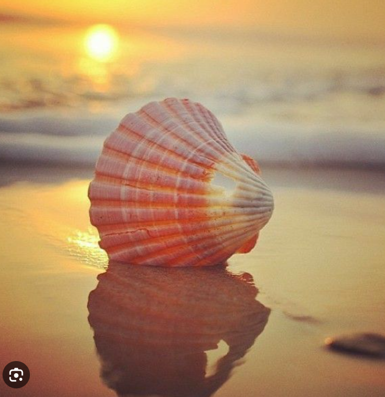
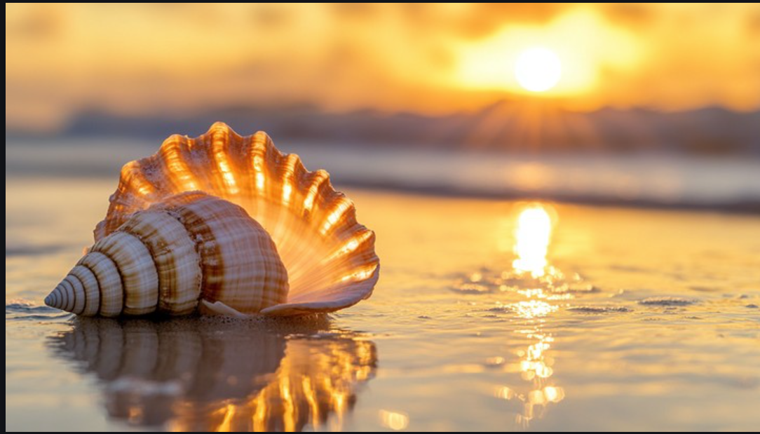
In this intermediate watercolor lesson, we are not simply painting a seashell we are painting the perception of light.
Watercolor is uniquely suited to luminosity because transparent pigment allows the white of the paper to remain part of the painting. By combining warm and cool color, transparency, complementary contrast, and value, we can make a simple object appear illuminated.
The glow doesn’t live in the shell. It lives in the relationships around it.
A warm golden yellow or orange becomes more luminous when surrounded by cooler blues. A light area appears brighter when placed beside a darker value. And transparent washes allow light from the paper to visually travel through the color.
Vocabulary
- Complementary Contrast — ( CLICK HERE FOR PRACTICE) placing opposite colors, such as blue and orange, near each other to increase their visual intensity.
- Luminosity — ( CLICK HERE ) the appearance that light is glowing from within a color or object.
- Transparency — ( CLICK HERE ) allowing the white paper and previous washes to remain visible through layers of watercolor.
- Simultaneous Contrast — the way one color changes how we perceive a neighboring color. A warm orange can appear warmer and brighter beside blue.
- Warm–Cool Contrast — using warm yellows and oranges against cool blues to create light, atmosphere and depth.
- Value Contrast — placing light values beside darker ones so the light appears brighter.
- Glazing — layering a transparent wash over a dry wash to deepen color without completely covering what is underneath.
- Reserved White — leaving areas of the watercolor paper untouched so the paper itself becomes the brightest light.
Painting the Light

Begin with the lightest warm wash on the shell. Preserve small areas of white paper where the strongest light occurs.
Build transparent layers of yellow, gold and orange, allowing earlier washes to remain visible.
Introduce cool blues around the warm areas rather than overmixing them. Let warm and cool colors meet, but protect some clean passages of each.
Strengthen the surrounding values. Remember:
You don’t always make the light brighter—you can make what surrounds it darker.
Finish with selective glazing to strengthen shadows, form and depth while preserving the transparent glow.
Takeaway
LIGHT = TRANSPARENCY + COLOR CONTRAST + VALUE CONTRAST
The goal isn’t simply to paint the color you see. It’s to understand why that color appears to glow—and recreate the conditions that allow the viewer to perceive light.
Leave a Reply