
SUPPLY LISTS
Local/Online Art Stores to Explore:
We are so lucky to have these incredible resources right in our backyard.
- Blue Goose Art Supply (Rock Hill, SC): A beloved staple for York County artists. Their friendly staff is incredibly knowledgeable, and they carry a wonderful selection of professional-grade watercolor paints and papers.
- Jerry’s Artarama (Charlotte): Wow! You can find everything you need here, often at high prices. It’s a fantastic place to compare brands side-by-side.
- Micheals (Local Art Store): While they carry a wide variety of crafts, their art supply section is robust. They are a great spot to pick up core watercolor supplies like pads of paper, sets of tubes, and a variety of brushes.
- Hobby Lobby Local Art Store: Don’t forget to check out local art chain stores. They often carry limited watercolor supplies.
- Cheap Joes (Boone, NC): A beloved staple for Triad-area artists.
- Online : Amazon
- Online: Dick Blick
One of the biggest “aha!” moments in watercolor is realizing you only need one color to create a stunning, dimensional painting. The secret? Value (how light or dark a color is).
In class we created a value scale using blends of Greens, then paint a houseplant where every leaf has a different value—from pale tea to thick butter. Let’s go!
Step 1: The Value Scale ( click here )
Think of your watercolor pigment as an ingredient you dilute or concentrate.
| Value Level | Name | Consistency | How to Mix |
|---|---|---|---|
| 10% | Tea | Transparent | 1 drop pigment : 9 drops water. Flows like weak black tea. |
| 20% | Coffee | Semi-transparent | Slightly more pigment. Looks like coffee with cream. |
| 40% | Milk | Medium transparency | Like 2% milk – you see through it, but it has body. |
| 60% | Cream | Semi-opaque | Heavy cream texture. Starts hiding pencil lines. |
| 75% | Butter | Opaque | Thick as melted butter. Use straight from the pan with minimal water. |
Pro Tip: Always mix more of each value than you think you’ll need. Consistency is harder to match later.
Homework:
1. Paint a Houseplant – One Color, Many Values
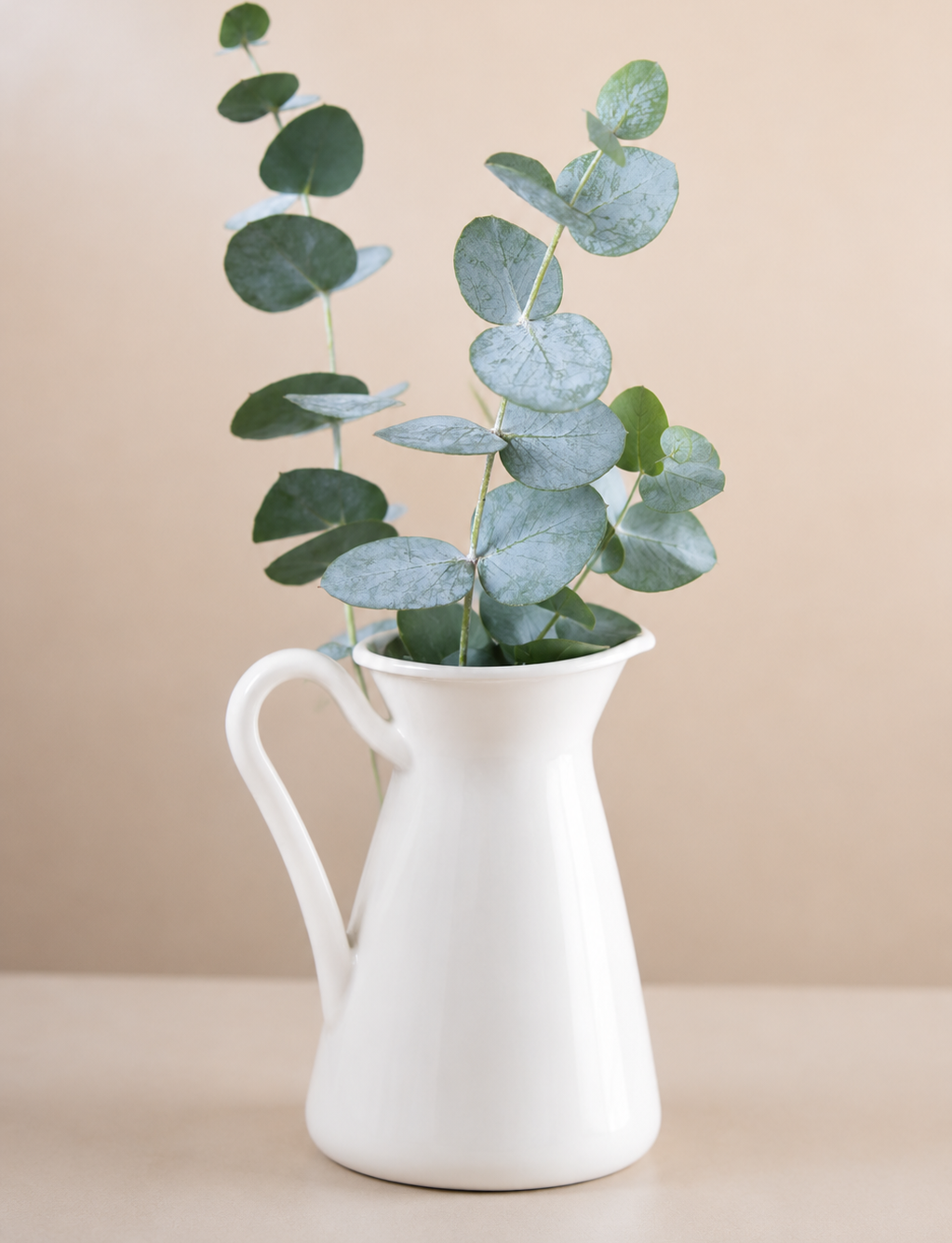
or create another : EUCALYPTUS PAINTING
2. Prepare your Fish Drawing for the next class –
3. Complete this Youtube tutorial – Click Here
In class we painted a eucalyptus branch (those silvery-blue-green leaves are perfect for value study). But instead of one flat green, each leaf will be a different value – from Tea to Butter.
STUDENT GALLERY


Step 1 – Transfer the Image
Use graphite to create transfer. Finish up by lightly sketching or trace a simple eucalyptus stem with 5–7 leaves. Keep pencil lines faint they should vanish under paint unless you want a sketchy look.
Step 2 – Add a Soft Background
Using your 10% Tea value, wet the area around the plant with clean water. Touch in the pale pigment and let it bloom softly away from the leaves. This creates instant depth. Let dry completely.
Step 3 – Paint the Leaves – Each a Different Value
Here’s the fun part. Assign a different value to each leaf, working from lightest to darkest so you don’t muddy your brush.
- Leaf 1 (back left): Tea (10%) – barely there, almost a ghost leaf.
- Leaf 2 (middle left): Coffee (20%) – delicate but visible.
- Leaf 3 (center top): Milk (40%) – the “true” midtone of your pigment.
- Leaf 4 (right side): Cream (60%) – rich and sturdy.
- Leaf 5 (bottom front): Butter (75%) – nearly full strength.
Don’t overblend! Eucalyptus leaves look wonderful with soft, cloudy edges inside the shape.
Step 4– Don’t Forget the Shadows
This is what makes the painting pop.
- Cast shadow on the pot: Mix Coffee (20%) and paint a crescent shape on the pot’s lower right.
- Shadow under the pot: Use Milk (40%) as a soft oval beneath the rim.
- Drop shadow on the table: The darkest shadow (between Cream and Butter) goes opposite your light source. Keep edges soft by wetting the table area first.
Step 5 – Final Reveal
When dry, you’ll see a eucalyptus branch with five distinct leaves – each a different value, yet all clearly the same color family. The pot feels solid, the shadows anchor it to the page, and the Tea-value background gives air.
That’s the magic of value: You painted with one pigment, but it looks like five.
Your Turn – Challenge
Paint a small plant, or just abstract leaf shapes. Assign a different value to each element. Bring to our next class I want to see your values in action!
Happy painting!
–Ida Mae
The Five Stages of Drying: Your New Secret Language
(CLICK HERE: learn more about drying )
Think of your paper as an active partner in the painting process. As it dries, its behavior changes dramatically. Learning to “read” the paper is the first step to total control.
1. Soaking Wet
The Look: Puddles on the surface. If you tilt your board, a bead of water will chase the edge.
The Behavior: The paper is fully saturated and can’t absorb more. Paint applied here will explode, drifting and feathering with wild, beautiful abandon. You have maximum time to blend and play.
Best For: Painting Wet into Wet for dreamy skies, soft backgrounds, and fluid washes without hard edges.
2. Shiny
The Look: A glossy sheen. No running puddles.
The Behavior: The paint will still bleed and bloom significantly, creating large, soft, feathery shapes. It’s perfect for intentional, controlled blooms.
Best For: Wet into Wet for soft edges and creating soft shapes like fur, foliage, or gradients.
3. Moist
The Look: The shine is fading. The paper feels cool and damp to the touch.
The Behavior: Paint will still bleed, but it won’t travel far. You get soft edges with more predictability than the “shiny” stage.
Best For: Wet into Wet with a lot of control and tiny blooms the very subtle edge changes
4. Damp
The Look: No shine at all. The paper feels barely damp and is cool or almost room temperature.
The Behavior: Adding a watery mix here will cause a backrun (or “cauliflower” effect) as the new water pushes the existing pigment aside.
Best For: Wet onto Damp/ almost dry to add defined details that have slightly soft, fuzzy edges
5. Dry
The Look & Feel: Completely dry, matte, and room temperature.
The Behavior: Any new paint sits on top as a separate layer. You get crisp, hard edges.
Best For: Final details, sharp lines, and glazing (adding transparent layers over dry paint).