
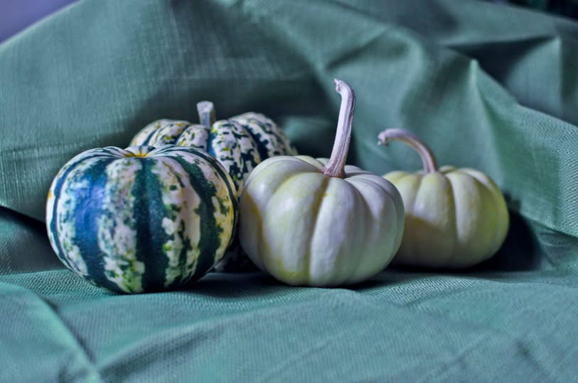
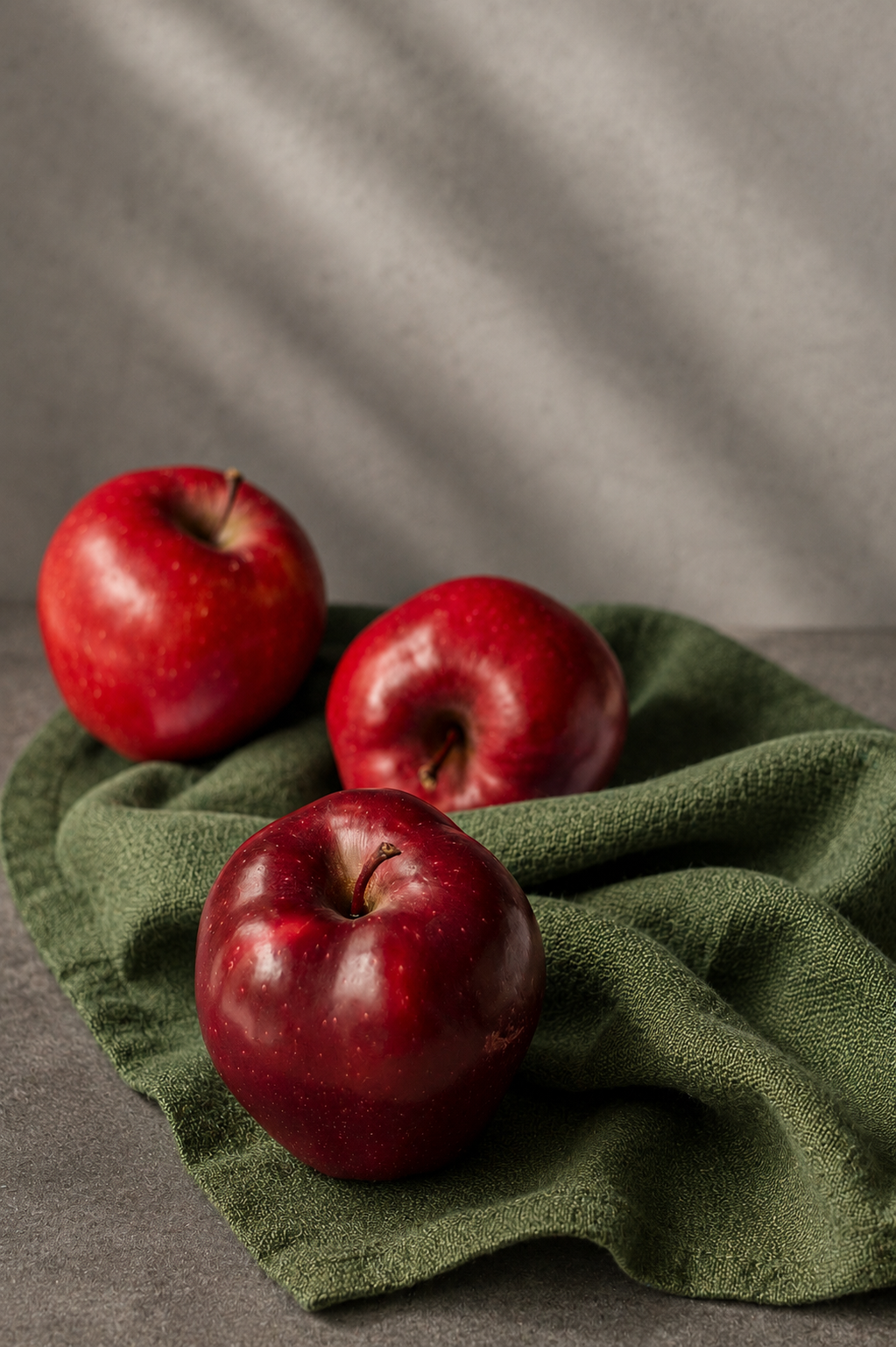
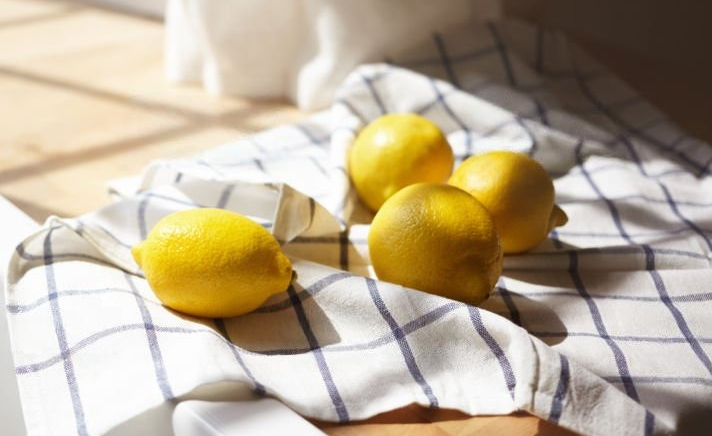

Light brings a painting to life, but shadows give it depth. Whether you’re painting a pear, an apple, or a simple ceramic vase, understanding how light travels across an object is essential to creating a convincing still life.
In this week’s watercolor lesson, we will explore the anatomy of a shadow, learning to identify highlights, mid-tones, core shadows, reflected light, and cast shadows.
By observing these different values and gradually building them through watercolor washes, we can transform a simple shape into a three-dimensional form.
When a light source strikes an object, it creates a range of values, from the brightest highlight to the deepest shadow. These changes in value help us understand the object’s form, texture, and relationship to its surroundings.
| Term | Definition |
|---|---|
| Highlight | The brightest area of an object where the light strikes most directly. In watercolor, highlights can be preserved by leaving portions of the white paper untouched. |
| Mid-tones | The values between the highlight and the darkest shadow. These transitional tones describe the object’s color and help create a gradual change in form. |
| Core shadow | The darkest area on the curved surface of an object, where it turns away from the light source. It often appears just before the reflected light. |
| Cast shadow | The shadow an object projects onto another surface when it blocks the light. Its direction and length depend on the position and angle of the light source. |
| Reflected light | Light that bounces off surrounding surfaces and softly illuminates the shadow side of an object. It is usually darker than the mid-tones and should not compete with the highlight. |
Tips for Creating a Still Life with Deep Shadows

1. Use a single light source
Position a lamp to one side of your fruit to create a clear division between light and shadow. Moving the light lower can produce a longer, more dramatic cast shadow. Turn off competing lights when possible.
2. Work from light to dark
Begin by preserving your highlights and applying a light wash across the fruit. Allow each layer to dry before glazing darker values. Slowly develop the mid-tones and core shadow.
3. Experiment with shadow colors
Shadows do not have to be black! Try mixing ultramarine blue with burnt sienna to create a rich, neutral shadow. Experiment with cool blues, violets, or warm browns to introduce color variation.
4. Pay attention to shadow edges
The cast shadow is generally darkest and most defined near the object. As it moves away, its edges may soften. Use a damp brush to create gradual transitions and a sense of atmosphere.

Prepare for our Next Class Together:

INTERMEDIATE WATERCOLOR COURSE : FRIDAYS
Casting Shadows


Artwork By Shelly Prior : Click Here
Exploring pattern, transparency, and negative space through fruit and fabric
In this advanced watercolor study, we will explore how light passes through open-weave materials and how a patterned surface changes as it moves across the curved form of fruit. We will use frisket (masking fluid) to preserve the lightest areas of the composition, allowing us to build rich, layered shadows without losing the delicate detail of the fabric.
Once the frisket is removed, we will return to the preserved white paper, introducing subtle shadows and reflected color to separate the lace from the table beneath it.
Our goal is to move beyond simply copying a pattern and begin understanding how light, negative space, and value communicate depth.
Understanding the relationship between fruit, fabric, and shadow
A patterned still life requires careful observation of three distinct visual elements:
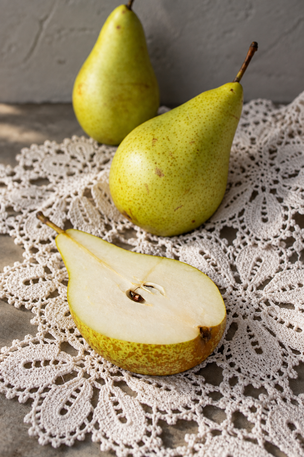
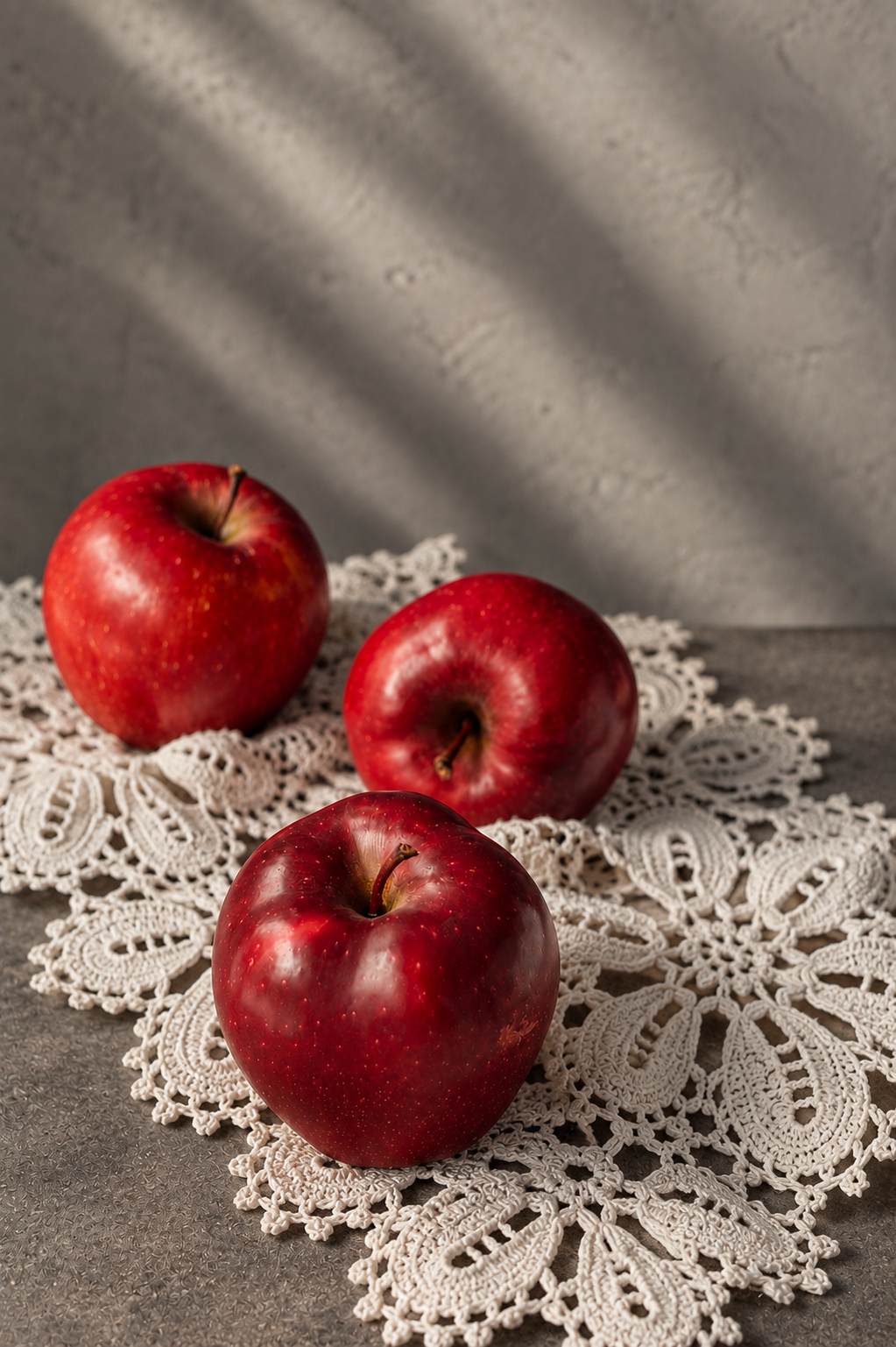
- The fruit: Its highlights, mid-tones, core shadow, and reflected light describe its three-dimensional form.
- The fabric: The folds, open spaces, decorative patterns, and edges create their own transitions between light and dark.
- The cast shadows: The fruit and fabric interrupt the light, creating shadows that connect the objects to the tabletop.
IN CLASS Technical practice:
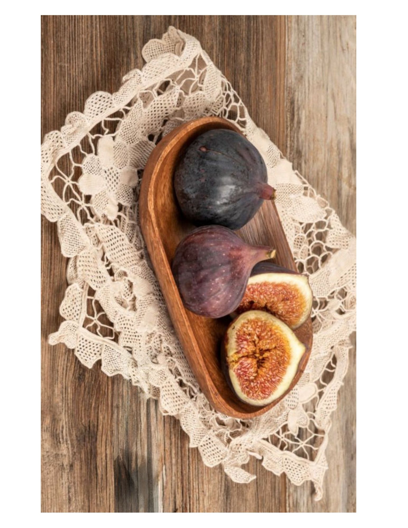
Using frisket to preserve lace

Step 1. Plan your composition and values
Choose a fruit and patterned material. Establish a single directional light source and make a preliminary sketch, identifying the brightest whites, deepest shadows, and negative spaces within the fabric.
Before painting, decide which light areas need masking and which can be preserved through careful brushwork.
Step 2. Apply frisket to preserve the whites
Apply masking fluid to the areas of the lace and selected highlights that must remain white. Use an old brush protected with brush soap, a silicone applicator, or a fine masking tool.
Work on completely dry watercolor paper and let the frisket dry fully before painting. Avoid masking every small detail; preserve only those areas that are essential to describing the light.
Step 3. Establish the first washes
Begin with transparent washes to establish the local colors of the fruit, fabric, and tabletop. Work around your masked areas and create a unified underpainting.
Develop the mid-tones before introducing darker values. Consider whether warm light and cool shadows, or the reverse, will strengthen your composition.
Step 4. Build the deep shadows
Use successive glazes to build the fruit’s core shadow and its cast shadow on the fabric and tabletop. Observe how the fabric pattern becomes less visible in deep shadow.
Keep the darkest values near areas of contact when appropriate, allowing the shadow edges to soften as they extend away from the object.
Step 5. Remove the frisket and develop the lace
Once the painting is completely dry, gently remove the frisket with clean fingers or a suitable masking-fluid remover.
Return to the preserved white areas and introduce controlled, diluted washes. Add subtle shadows directly onto selected white lace shapes to create dimension and distinguish the raised fabric from the tabletop beneath it.
Use soft gray, blue, violet, or warm neutral tones to define folds, openings, and the fabric’s thickness. Preserve the brightest accents to maintain the appearance of light.
Leave a Reply