Understanding Value & Perspective through Layers, and Loose Abstraction
Landscape painting is more than recording what you see, yet it’s about creating a sense of space, mood, and atmosphere. Whether your goal is realism or expressive abstraction, the tools of complete value and saturation of color, will help build depth. Use these to guide the viewer’s eye through your work.

paintings by : Francine Bradette
Value: Light & Dark as Structure
Value is the backbone of any strong landscape. Even before color comes into play, values establish the drama and spatial order of a scene.
- Foreground: Use the darkest, highest-contrast values here. Sharp marks and crisp edges feel closer to the viewer.
- Middle Ground: Mid-values begin to soften, with less contrast between light and dark.
- Background: Lightest washes and hazy tones recede into the distance.
A simple value sketch (using only Payne’s grey watercolor ) is a great way to train your eye to see and simplify the tonal structure of a landscape.
Perspective:
Color , Form and Composition
Perspective in landscapes isn’t only about vanishing points — it’s about atmospheric illusion.
- Aerial Perspective: Use color and value for distant trees or hills lose contrast, edges blur, and colors desaturate. This natural phenomenon is one of the most effective ways to push depth. Pale, diluted, and cooler washes (misty blues, greys, violets) help elements drift into the horizon.
- Scale: Placing large, bold shapes in the foreground and gradually smaller, lighter ones in the distance creates spatial rhythm.
- Overlap: Layering shapes — a tree in front of a hill, a shadow falling across a field — enhances dimensionality.
- Foreground Colors: Rich, saturated hues (a deep green, a strong ultramarine, a warm sienna) bring energy forward.
Practice: Loose Abstract Layers
One of the best exercises is to practice with loose, abstract watercolor or ink washes — like the studies shown in the image above.
- Lay down a broad wash with varied water content.
- While still wet, drop in darker pigment to suggest trees or shadow.
- Add minimal linear marks (like grasses, branches, or horizon lines) for grounding.
- Leave white paper as negative space — it suggests light and breathes air into the composition.
The goal isn’t detail but mood — building depth through contrast, value, and suggestion.
Blooms and Blossoms Creating Atmosphere
Transitions are as important and to get variety some Techniques include:
- Wet-on-Wet: Painting on damp paper to create soft, blurred edges for skies and distant hills.
- Wet-on-Dry: Painting on dry paper for sharp, controlled edges like detailed trees or rocks.
- Blooms: A textured effect created when water pushes drying pigment to the edge of a wash.
- Texture: The visual surface quality of an area, suggesting roughness, smoothness, or foliage.
- Blossoms: Organic, feathery shapes formed when wet paint diffuses into a damp area on the paper.
- Granulation: A granular texture where pigment particles separate, ideal for stone, bark, or earth.
Blooms and blossoms are not about loosing control but about learning when to let the water flow and when to hold back.

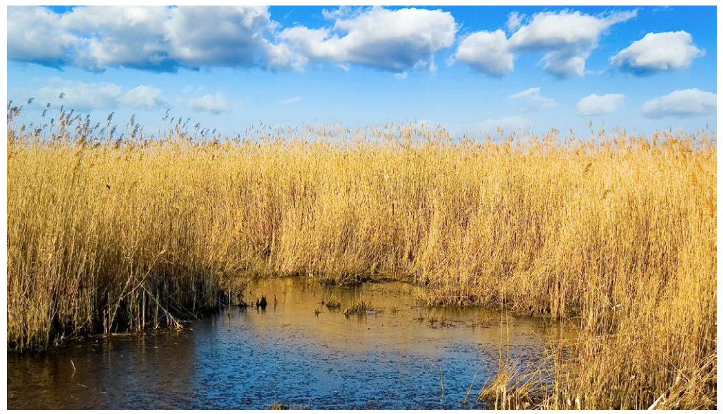
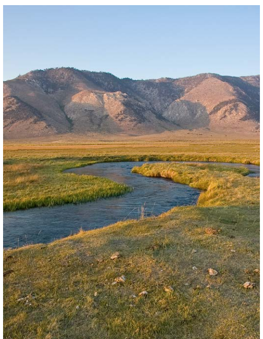
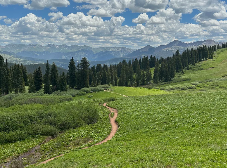
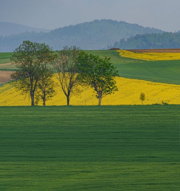
Choose one of the landscapes below to paint or capture your own unique Carolina landscape! Search Here for your next Landscape Inspiration: Click
